Appearance
扩展组件
添加新组件
当前版本已内置了一批常用组件,供您在设计器中直接使用。如果您需要二次开发表单设计器、扩充更多内置组件,可以按照以下步骤进行:
- 找到组件定义路径:
...\src\designer\config\base,该目录存放了所有内置组件的定义。
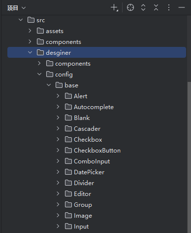
在该目录下为您的新组件创建一个子目录,例如:
MyInput。参考
Input目录下的文件结构,一般包含:default.ts:组件初始配置define.ts:组件定义入口configSchemas.tsx:基本属性可配置项eventSchemas.tsx:事件属性可配置项slotSchemas.tsx:插槽属性可配置项
在新组件的
define.ts中,确保key和componentName不与其他组件重复:
typescript
const define: DesignComItem = {
  menuRootKey: 'inputer',
  menuItem: {
    order: 5,
    label: '新输入框',
    desc: '通过鼠标或键盘输入字符',
    icon: 'designer:input',
    key: 'MyInput',
    componentName: 'MyInput',
    defaultModel: defaultModel
  },
  enableChanges: [],
  autoInit: false,
  configSchemas: configSchemas,
  eventSchemas: eventSchemas,
  slotSchemas: slotSchemas
}- 在设计器项目中将您的新组件注册到画布表单,使其在设计器画布中可以被正常渲染与预览。
通常会在 imports.ts(或项目中约定的导入配置文件)中注册组件:
typescript
import { MyInput } from '@/components/MyInput'
import type { FormImportItem } from 'advanced-ele-ui'

const formImports: FormImportItem[] = [
  {
    name: 'MyInput',
    component: MyInput
  }
]- 同时,业务侧渲染端也需要具备该组件的实现。在业务应用的
main.ts中,通过formImports属性注册自定义组件:
typescript
import AdvancedEleUI from 'advanced-ele-ui'
import 'advanced-ele-ui/dist/style.css'
import { MyInput } from '@/components/MyInput'

app.use(AdvancedEleUI, {
  locale: 'zh-CN',
  formImports: [
    {
      name: 'MyInput',
      component: MyInput
    }
  ]
})
注意事项
- 自定义组件务必支持
modelValue属性,并通过update:modelValue事件实现双向绑定。 - 组件事件建议仅暴露一个参数,例如:
emit('change', val),避免使用emit('change', val1, val2)这类多参数形式,以便在表单设计器内统一处理与映射。